The logo image of Gwanghwamun Square was created to help ordinary citizens easily recognize the park. The logo of the square is expected to be widely accepted by the citizens of Seoul, and grow into a favored symbol of Gwanghwamun Square. As for use of the logo, no one, neither individuals nor organizations, will be allowed to change its design or color arbitrarily. They need to observe the guidelines established for the use of the logo.
The logo of Gwanghwamun Square is conceived from the original script of the Korean writing system called Hunminjeongeum, and expected to highlight the cultural significance of the square and the writing system of the Korean language. Considering that the square is a popular tourist attraction for both domestic and international visitors alike, the logo consists of the names of the square in both Korean and English. The logo may consist only of Korean if it is used for a special purpose, such as commemorating a historic achievement. Example) Hangeul Day
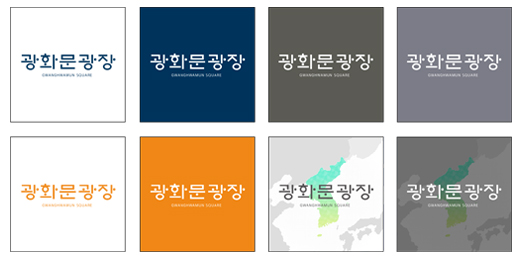
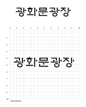
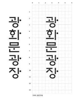
The logo of Gwanghwamun Square has a few variations, horizontal Korean-English combination, vertical Korean-English combination, horizontal Korean only, vertical Korean only, and so on. The variations are advised to be used according to the guidelines provided to the users.
Colors are crucial for characterizing the logo of Gwanghwamun Square. Therefore, it is important that the users use the colors of the logo in a correct and harmonious manner as provided by the guidelines. The colors of the Gwanghwamun Square logo were selected from the Seoul Color Scheme developed by the Seoul Metropolitan Government and can be used in both CMYK and RGB. As for the use of colors, users are required to follow the rules provided in this guideline. Users can use secondary colors to support the primary colors of the Gwanghwamun Square logo. The secondary colors are also selected from the Seoul Color Scheme. Users can also choose to use either CMYK or RGB according to the end destination of the project. As for the use of colors, users are required to follow the rules provided in this guideline.
Primary color

SC6908 Seoul Color 50, a color of profundity expressing concentration of cultures and future orientation of Gwanghwamun Square
C100 M60 Y20 K54
Secondary colors
SC1998 Applying Seoul Color 50, symbolizing the bright future of Gwanghwamun Square as well as happy citizens and wisdom of the past
C0 M58 T92 K0
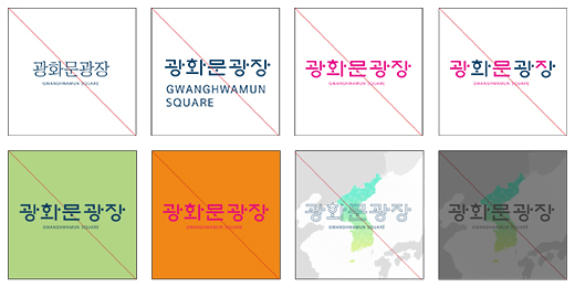
Users should consider the background color when they use a Korean-English combination logo Because the logo of Gwanghwamun Square is an important part of the symbol of the square, users should not change or revise its color, form or script arbitrarily. They are required to pay attention to the Don’t examples below as they are examples strictly prohibited.